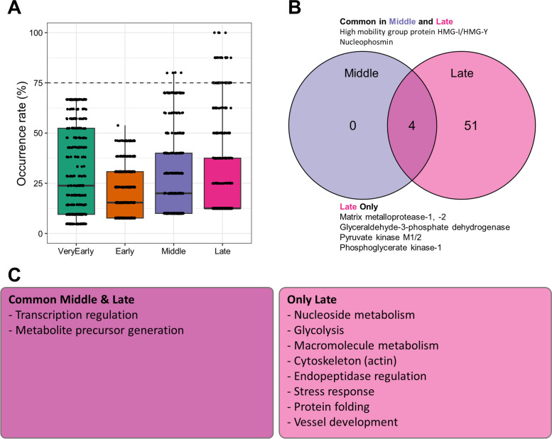
Fig. 4.
Gene ontology analysis of SASP classified by time series. A A box plot is presented to show the occurrence rates at each time point. The horizontal dashed line represents the threshold for selecting common ontology occurrence rates higher than 75%. B A Venn diagram is provided to identify the common and specific ontologies among the different time points. The names of proteins with central roles in each ontology and frequently included in datasets at each time point are indicated. C The main outcomes of the GO analysis are summarized. Common and specific ontologies are categorized based on their functions and displayed in the box

