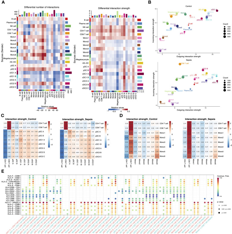
Figure 5.
Intercellular communication in the peripheral blood of septic patients and healthy controls. (A) Heatmap showing the differential number of interactions among different cell types in sepsis versus healthy control (left). In the center, red stands for increased number of interactions, blue for decreased number of interactions. The bar plot above shows the sum of the changes in the number of incoming signals for each cell type. The right bar plot shows the sum of the changes in the number of outgoing signals for each cell type. The differential interactions strength among different cell types in sepsis versus healthy control (right). (B) Bubble plot showing the incoming and outgoing interaction strength for each cell type in healthy controls (top) and septic patients (bottom). The dot size represents the count of interactions. (C) Interaction strength of T cell subtypes and DC subtypes in control and sepsis. (D) Interaction strength of T cell subtypes and monocyte subtypes in control and sepsis. (E) Bubble plot showing the interaction possibility of all APC subtypes and T cells subtypes during control or sepsis through MHC I and MHC II pathway-related ligand-receptor pairs.

