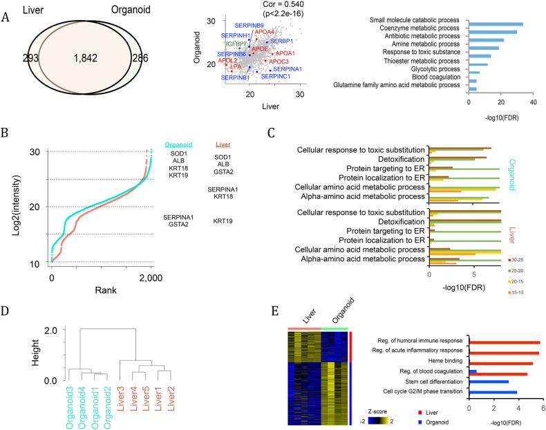
Fig. 3. Proteomic analysis of liver organoids.
A Venn diagram representing proteins shared between in vivo liver and in vitro organoids. The correlation is also shown with the scatterplot, and the overrepresented GO terms of the shared proteins are shown by a bar graph. B Ranked plot of log2(intensity) of proteomics data in organoid (blue) and liver (red). Proteins are categorized by four intensity ranges (25~, 20–25, 15–20 and 10–15). Representative liver markers in each intensity range are shown in the right panel. C Bar plot showing overrepresented Gene Ontology terms in each intensity range. D Unbiased clustering of proteomic data. Clustering was performed to log2(intensity) value of all expressed genes (log2(intensity)>10). E Differentially expressed proteins and their overrepresented GO terms. All of the above experiments were performed with the hiPSC line AG27.

