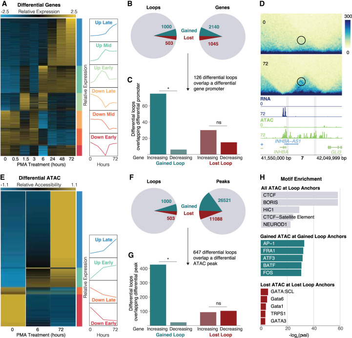
Figure 2.
Gene expression and chromatin accessibility changes at differential loops. (A) RNA-seq normalized counts for all differential genes. Clusters are indicated by bars on the right side of the heatmap. Line plots show the mean expression per cluster. (B) Pie charts showing the proportion of differential loops (left) and genes (right). (C) Concordance analysis for the 126 differential loops that had a differential gene promoter at an anchor. Asterisk represents P < 0.05 (binomial test). (D) Example region of a gained loop with increased gene expression and chromatin accessibility at the INHBA locus. (E) ATAC-seq normalized counts for all differential peaks. Clusters indicated by bars on the right side of the heatmap. Line plots show the mean expression per cluster. (F) Pie charts showing the proportion of differential loops (left) and ATAC peaks (right). (G) Concordance analysis for the 647 differential loops that had a differential ATAC peak at a promoter. Asterisk represents P < 0.05 (binomial test). (H) TF motif enrichment analysis on all ATAC peaks at all loops (top), concordant gained ATAC peaks at gained loop anchors (middle), and concordant lost ATAC peaks at lost loop anchors (bottom).

