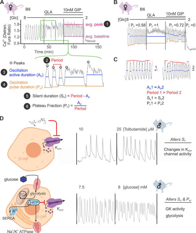
Figure 2. Ca2+ wave breakdown reveals mechanisms underlying Ca2+ responses.
(A) An example B6 female Ca2+ wave, showing that the islet oscillations can change in their average peak (1) and average baseline in response to different nutrients. Additionally, shifts in wave shape (green box) can be broken down into changes in time between peaks (period, 2), the time in the active phase (active duration, AD, 3), and the length of the oscillation (pulse duration, PD, 4). From these, the time inactive between oscillations (silent duration, SD, 5), and the relative time in the active phase, or plateau fraction (PF, 6), can be calculated. Each parameter can be changed by different underlying mechanisms. (B) For islets that plateaued, as in the example islet in 8G/QLA, they were assigned a plateau fraction of one and a period of zero. For islets that ceased to oscillate, such as the example islet in 2 mM glucose, they were assigned a plateau fraction of zero and a period of the time of measurement (40 min). (C) For trace 1 (left), which has a longer period (red bars) than trace 2 (right), but the same active duration (blue bars), the silent duration is greater and consequently the PF is shorter, in contrast to the trace in (A) where the PF increases between 8G and 8G/QLA are largely due to increases in AD. (D) Changes in specific Ca2+ wave parameters can reflect different mechanisms in β-cells. For example, changing KATP activity pharmacologically (upper panels) predominantly increases PF by altering SD, whereas increasing glucose concentrations by elevating glucose or activating GK cause significant alterations in both AD and SD to increase PF. Abbreviations: ‘[Glc]’ = ‘concentration of glucose in mM’; ‘GK’ = ‘glucokinase’.


