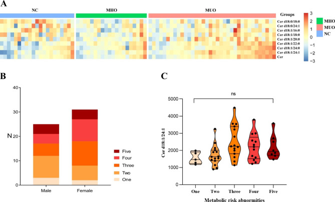
Fig. 1.
Ceramide distributions in the cohort
A: The heatmap shows the relative abundances of ceramide levels among the three groups. The concentration values of ceramides were normalized by the logarithm to base 2 and the legend shows the relative abundances in Z score. The color intensity (from blue to red) suggests low to high concentration values. Three groups were distinguished by different colors of upper legends (blue for “NC”, green for “MHO” and pink for “MUO”).
B: Population distribution of metabolic risk abnormities by sex
C: The variation tendency of serum Cer d18:1/24:1 levels in populations with “one” to “five” metabolic risk abnormities. The violin plot shows the median and quartiles of ceramide levels, of which the features also show the distribution of data

