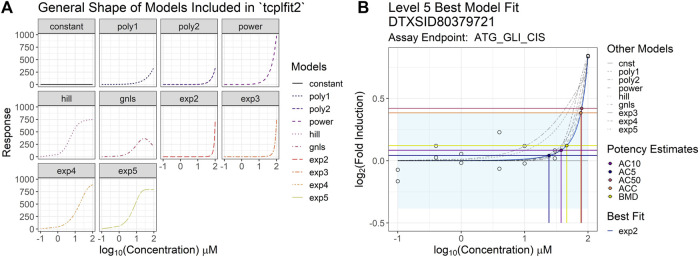
FIGURE 2.
Examples of tcpl v3.0 curve-fitting (A) contains simulated concentration-response curves to illustrate the general underlying curve shape covered by each of the models included in the tcplfit2 package and used on the backend of the level 4 data processing in tcpl. Each sub-plot in the figure corresponds to a single parametric model included in the model fitting process and has a corresponding color and line type to accompany it. All sub-plots are plotted such that the x-axis represents the log10-transformed concentration, and the y-axis represents the response values. (B) illustrates the results from the Level 5 analyses in the tcpl pipeline package including the best model fit and subsequent point-of-departure (POD) estimates. The model with the lowest AIC value is selected as the winning model (modl) and is used to determine the activity hit call (hitc) for the concentration series. If two models have equal AIC values, then the simpler model (i.e., model with fewer parameters) wins. The light-blue shaded region represents the estimated efficacy cutoff (coff). Each of the concentration-response models fit in Level 4 are included in the plot, where the blue curve indicates the best model fit for the observed data (white circles) and the rest are depicted by the gray curves. The horizontal lines show the activity responses from which potency estimates of interest are defined, and the vertical lines show the corresponding POD estimates. The black point shows the AC5 (concentration producing 5% of the maximal response), the purple point shows the AC10 (concentration producing 10% of the maximal response), the yellow point shows the BMD (benchmark dose), the orange point shows the ACC (concentration producing a response at the efficacy cutoff), and the pink point shows the AC50 (concentration producing 50% of the maximal response).

