
Figure 1: Bivariate relationship between burnout and EHR time, by EHR time category (n=34).
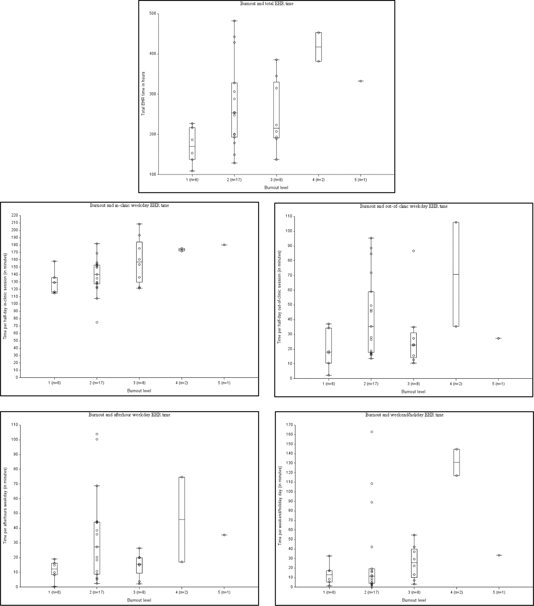
Each graph represents a scatterplot of burnout (X-axis) and EHR time (Y-axis), with a separate graph for each EHR time category. Overlying the scatterplots are boxplots, with bands representing the median, and the top and bottom of the box plot representing the first and third quartiles (respectively).