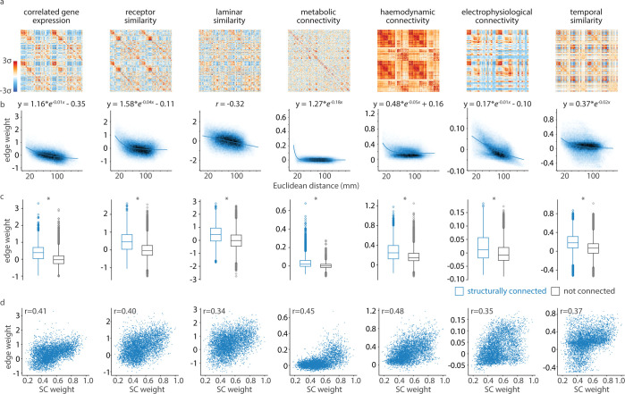
Fig 1. Common organizational patterns of connectivity modes.
Each connectivity mode is represented as a normalized similarity matrix, where elements of the matrix index how similarly two cortical regions present a specific feature. (a) Connectivity modes are shown as heatmaps, ordered according to the 400-region Schaefer parcellation [48]. The colorbar limits are −3 to 3 standard deviations of the edge weight distribution. (b) Edge weights between every pair of cortical regions (i.e., upper triangular elements) decrease with Euclidean distance across all 7 connectivity modes. Darker color represents greater density of points. Exponential equations or Spearman correlation coefficients are shown depending on whether the relationship is better fit by an exponential or linear function. Similar relationships with geodesic distance are shown in S2 Fig. (c) Edge weight distributions are visualized separately for edges that also exist in the structural connectome (blue) and those that do not (gray), according to a group-consensus structural connectome from the HCP [43]. Structurally connected cortical regions show greater similarity than regions that are not structurally connected. Boxplots represent the first, second (median), and third quartiles, whiskers represent the non-outlier end-points of the distribution, and diamonds represent outliers (>1.5 inter-quartile range). (d) For edges that also exist in the structural connectome, connectivity mode edge weight increases with the strength of the structural connection. The data underlying this figure can be found at https://github.com/netneurolab/hansen_many_networks. HCP, Human Connectome Project.

