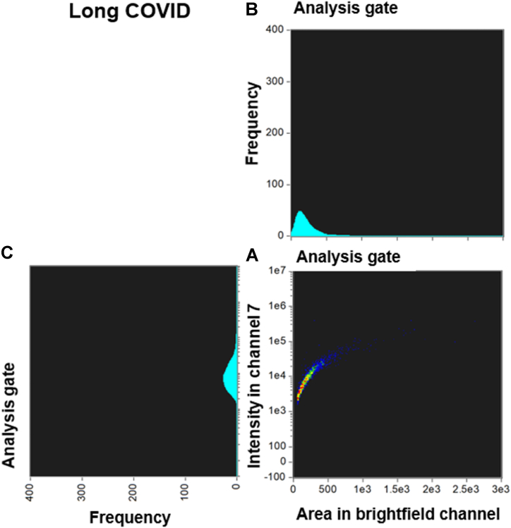
Fig. 6.
Density dot plot and corresponding cytograms of a representative Long COVID using the analysis template. (A) The density dot plot (bottom right) depicts microclot events, as defined by the intensity mask. The x-axis of the density dot plot represents the area of intensity in channel 7, while the y-axis represents the intensity in channel 7. (B) The top right graph displays a cytogram projection of the x-axis on the density dot plot, (C) while the bottom left graph represents a cytogram projection of the y-axis on the density dot plot. Both cytograms depict the frequency or number of events along each axis. As demonstrated in the density dot plot, the microclot events within the Long COVID sample are very high, resulting in a very high frequency in both cytograms. The number of objects per milliliter is 160054 objects/mL.

