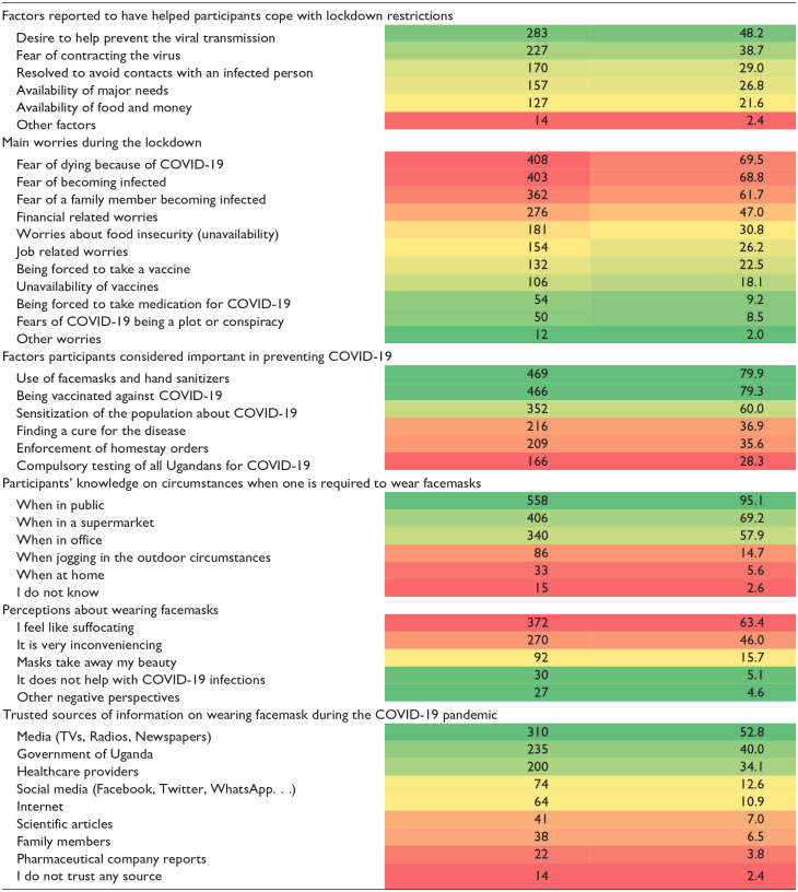
Table 2.
Heat Plot Showing Participants’ Perspectives on COVID-19 Control Measures and Media Sources.
| Assessment of participants’ perspectives | People reporting being worried. | |
|---|---|---|
| N = 587 | % | |

| ||
This was a multiple-response question, so the total percentage is >100.
The heat plot table used a traffic coding system with a spectrum of colors between green and red, with green denoting low-denoting-low/good, yellow for medium, and red for high/bad.
