. 2023 Jul 20;32(5):2087–2110. doi: 10.1044/2023_AJSLP-23-00007

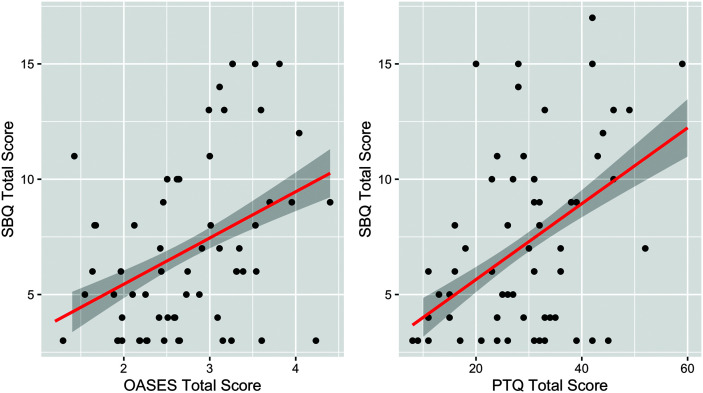
Figure 3.

2 scatterplots. The first scatterplot depicts the correlation between the S B Q Total Score and the O A S E S Total score. The line of best fit has a positive slope and it runs between (0.5, 4) and (4.5, 12). The shaded region around the best fit line is bounded by 2 lines. The first line runs between (1.8, 5) and (4.5, 11.5). The second line runs between (1.8, 3.5) and (4.5, 9). The second scatterplot depicts the correlation between the S B Q total score and the P T Q total score. The line of best fit is a straight line with a positive slope that runs between (8, 4) and (60, 12). The shaded region around the best fit line is bounded by 2 lines. The first line runs between (10, 5) and (60, 13). The second line runs between (10, 3.5) and (60, 11). All values are estimated.

The raw data between SBQ-R, OASES, and PTQ Total Scores are visualized. The regression line is visualized in red. The shaded portion indicates the standard error of the prediction. SBQ-R =Suicide Behavior Questionnaire–Revised; OASES = Overall Assessment of the Speaker's Experience of Stuttering; PTQ = Perseverative Thinking Questionnaire.