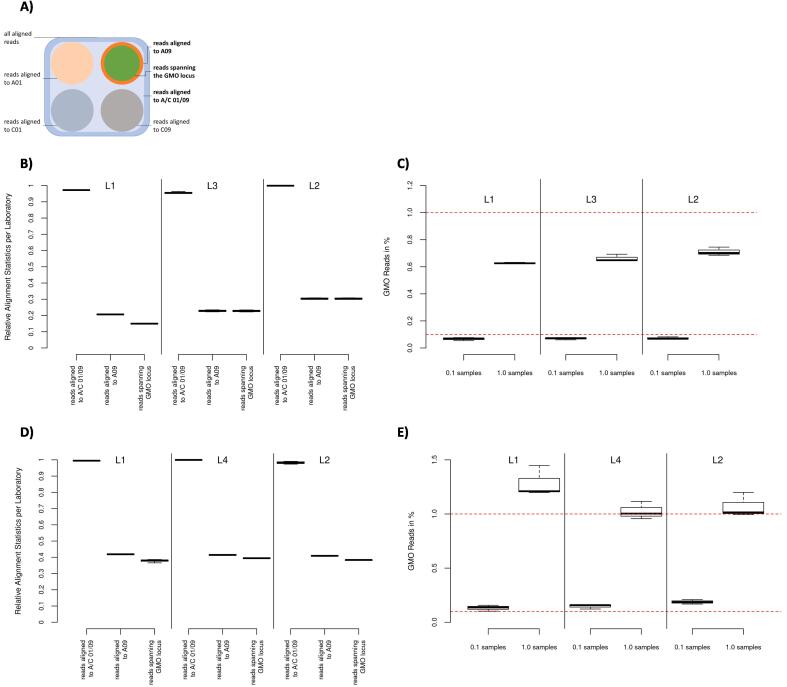
Fig. 2.
Shows the post alignment results of the short read (B and C) and long read (D and E) data sets, respectively. (A) depicts the read groupings for the subsequent analyses, starting with the total aligned reads (dark blue), to the subgroup of reads aligned to the targeted regions (light blue) and finally the reads spanning the GMO locus (green) within the group of reads aligning to chromosome A09 (orange). (B) and (D) show the alignment distribution of the short read and long read data sets, respectively. Showing the relative amount of reads aligning to the target regions, aligning to A09 within the target region and spanning the GMO locus per laboratory respectively as boxplots. (C) and (E) show the percentage of reads with a GMO modification versus all reads spanning the GMO locus using 0.1% spiked samples and 1.0% spiked samples per laboratory respectively as boxplots. The red dotted lines show the targeted spike (0.1% and 1.0% of all reads spanning the GMO locus). The boxplots show, from lowest to highest bar, the minimum, the 25th percentile, the median, the 75th percentile and maximum values per sample set respectively. (For interpretation of the references to colour in this figure legend, the reader is referred to the web version of this article.)

