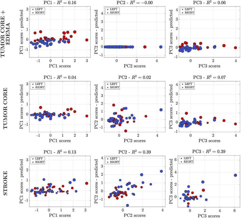
Fig. 6.
Ridge regression analysis. Scatter plots of predicted scores for each component are represented. Each dot represents a subject, and the color of each dot represents the side of the lesion (red = lesion in the left hemisphere; blue = lesion in the right hemisphere). The diameter of each colored circle is proportional to the lesion's volume. The model provides an accurate prediction of behavioral scores for PC1 and PC2 in stroke population (third line). The model is not significant in the neuro-oncological population when considering the tumor core only, without oedema. When considering the region of the tumor core plus oedema, the association was significant for PC1 (upper and middle lines).

