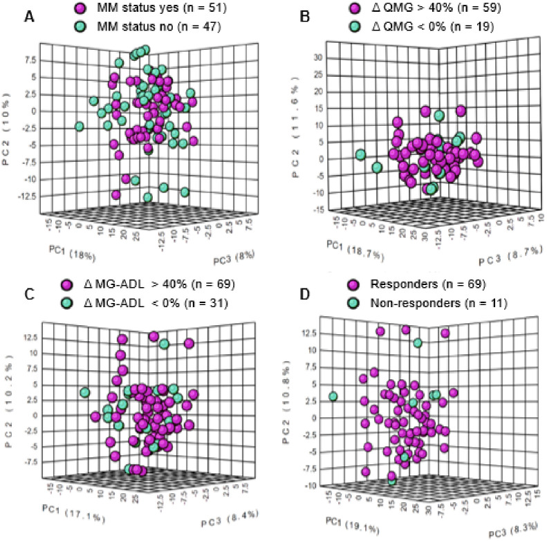
Fig 3. A three-dimensional plot showing metabolomic data structure for subjects in each clinical outcome measure.
Principal component analysis (PCA) shows intergroup separation is shown on the X axis and intra-group variability on the Y axis based on serum metabolite and lipid profiles. Treatment responsive subjects are represented in cyan blue and treatment non-responsive subjects are represented in purple in each plot. (A) MM Status (Yes n = 51 vs. No n = 47) (B) change in (Δ) QMG score (> 40% n = 59 vs ≤ 0% n = 19), (C) change in (Δ) MG-ADL score (> 40% n = 69 vs < 0% n = 31), and (D) Responders (Responders n = 69 vs Non-responders n = 11).

