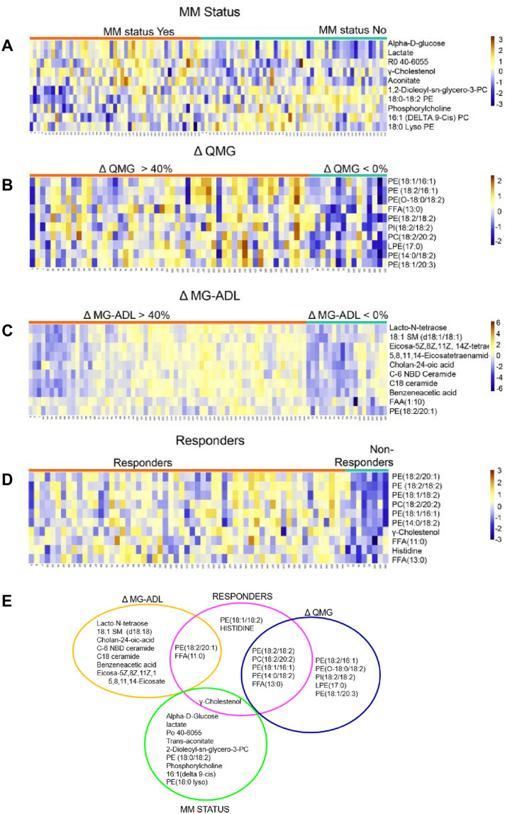
Fig 5. Top 10 significantly changed metabolites and lipids in each clinical outcome measure group.
Heatmaps are show in A-D. Each row represents a metabolite or lipid and each column represents a sample. Samples were separated based on clinical outcome (X-axis, orange treatment responsive, teal treatment non-responsive). Each feature is expressed as relative abundance represented in the orange-blue color scale. The orange color indicates increase in levels and the blue color represent decrease in levels. (A) MMS status, yes vs. no (B) change in (Δ) QMG (> 40% vs. < 0%) (C) change in (Δ) MG-ADL (> 40% vs. < 0%), (D) Responder versus Non-Responder. (E) Venn diagram of top 10 altered metabolites and lipids in each outcome group. Differences between outcome groups were tested using the non-parametric Mann Whitney U test and FDR correcting for multiple testing with Benjamini-Hochberg procedure two-sided. P-values < 0.05 are statistically significant. Individual p-values for each metabolite and lipid are reported in S2 Table.

