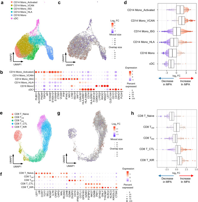
Fig. 2. Differential abundance analysis for the immunological characterization of MPA.
a UMAP plots showing the monocyte subpopulations in a total of 15 study participants including healthy donors (n = 7) and patients with MPA (n = 8). Six cellular clusters were identified; activated CD14+ monocytes (CD14 Mono_Activated), CD14+ monocytes characterized by VCAN gene expression (CD14 Mono_VCAN), CD14+ monocytes characterized by interferon signature gene expression (CD14 Mono_ISG), CD14+ monocytes characterized by HLA gene expression (CD14 Mono_HLA), CD16+ monocytes (CD16 Mono), and classical dendritic cells (cDC). b Balloon plot showing highly expressed genes in each monocyte subpopulation shown in a. Balloon color indicates the averaged scaled expression of the indicated genes. Balloon size indicates the percentage of cells expressing the indicated genes. c Neighborhood graph of monocytes using Milo differential abundance testing. Nodes represent neighborhoods from the monocyte population. Colors indicate the log2-fold difference between patients with MPA and healthy donors. Neighborhoods that increased in patients with MPA are shown in red. Neighborhoods decreased in patients with MPA are shown in blue. d Beeswarm and box plots showing the distribution of log2-fold differences in neighborhoods in different cell type clusters. Colors are represented similarly to c. Box plots are created in a similar fashion as in Fig. 1f. e UMAP plots showing the CD8+ T cell subpopulations in 15 samples. Five cellular clusters were identified; naïve CD8+ T cells (CD8 T_Naïve), central memory CD8+ T cells (CD8 T_CM), effector memory CD8+ T cells (CD8 T_EM), cytotoxically active CD8+ T cells (CD8 T_CTL), and CD8+ T cells characterized by KIR gene expression (CD8 T_KIR). f Balloon plot showing highly expressed genes in each population shown in e. g Neighborhood graph of CD8+ T cells based on Milo differential abundance testing. The analysis was performed similarly to c. h Beeswarm and box plots of CD8+ T cells based on Milo differential abundance testing. The analysis was performed similarly to d. Box plots are created in a similar fashion as in Fig. 1f.

