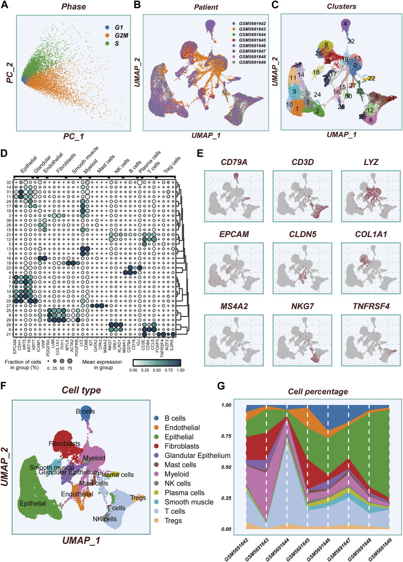
FIGURE 2.
Flow chart of single cell analysis. (A)PCA dimensionality reduction clustering was performed according to the cell cycle related scores (G1, G2M, S-phase scores). (B) A tSNE plot showing the distribution of cell samples from different LUAD tissues. (C) A total of 33 cell subsets were separated by dimensionality reduction clustering. (D) Bubble plots showing the expression of marker genes corresponding to each cluster. (E) Multiple UMAP plots showing the expression of classic cell type marker genes. (F) A tSNE plot demonstrating the distribution of different cell types. (G) A histogram showing the variation of cell proportions between different samples.

