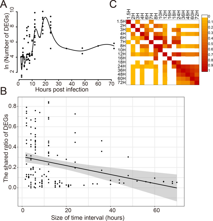
Figure 2. Dynamic response of human cells to influenza virus infection.
(A) The number of DEGs at different time points after infection. (B) The correlation analysis between the shared ratio of DEGs and the size of time intervals. The black line referred to the linear regression fitting and the gray area referred to the 95% confidence interval of the regressed line. (C) The shared ratio of DEGs among different time points after influenza virus infection which was colored according to the figure legend on the top right. The shared ratios of DEGs in the upper and lower triangular heatmaps were calculated by using the total number of DEGs in the left and top time points as the respective denominators, and by taking the shared number of DEGs between the left and top time points as the nominator.

