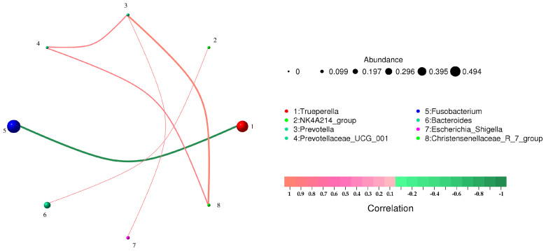
Figure 4.
Correlation network analysis of bacterial structure in different pus samples at species level. Circles represent species, and the size of circles represents the average abundance of species; the lines represent the correlation between the two species, and the thickness of the lines represents the strength of the correlation; line colors: red for positive correlation, green for negative correlation.

