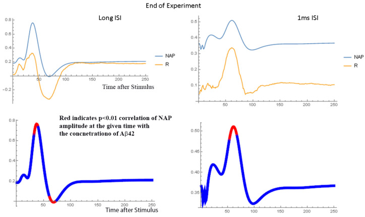
Figure 7.
Shows the normalized NAP at the beginning of the experiment along with the R value associated with the Spearman rank correlation analysis when applied to each time point in the NAP waveform. The lower set of figures shows on the NAP waveform the times when the R value associated with the Spearman rank correlation analysis is significant with p < 0.01. Short and long interstimulus interval at 15 mA current. In the lower plots, the red areas highlight the parts of the NAP waveform that are most highly correlated with the concentration of Aβ42. The observation that the plot of R versus time is similar to that of the NAP indicates that the presence of Aβ42 does not significantly change the shape of the NAP.

