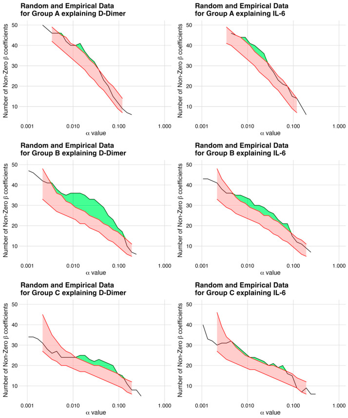
Figure 2.
Non-Zero Coefficients in Simulated Models vs. Empirical Data. The figure depicts a plot for each model, representing the simulated data with the same correlation structure as the empirical data. The x-axis defines the regularization parameter alpha, while the y-axis shows the number of non-zero coefficients. The red bands represent the simulated data between the 5th and 95th quantile and the green band highlights the number of statistically significant candidates, which are most pronounced for group B explaining D-dimers. This plot provides a visual representation of the relevance of each model, allowing easy comparison and identification of the most informative models.

