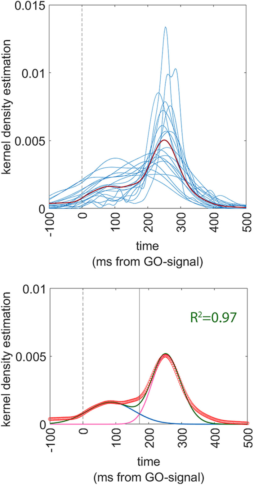
Figure 5.
Analysis of distribution of the RTs in the sham condition of experiment 2. The vertical dashed line indicates t = 0 ms, i.e., the onset of the GO-signal. Upper panel shows the superimposed individual Gaussian kernel density estimates of the 19 participants (thin blue lines) together with the mean Gaussian kernel density estimate of the whole population (thick red line). Lower panel shows a superimposition of the actual data and of the fitting functions, together with an indication of the goodness-of-fit. Actual data are presented as a scatterplot of hollow red circles, indicating the Gaussian kernel density estimates of the population (repeating the data of the thick red line of the upper panels). Fitting skewed-Normal functions are shown as continuous lines. The two skewed-Normal functions required to obtain optimal fitting are shown in purple and blue, and their sum is shown in green. The solid vertical line represents the point of optimal separation between the two distributions (t = 172 ms). The goodness of fit is shown as the R2 value.

