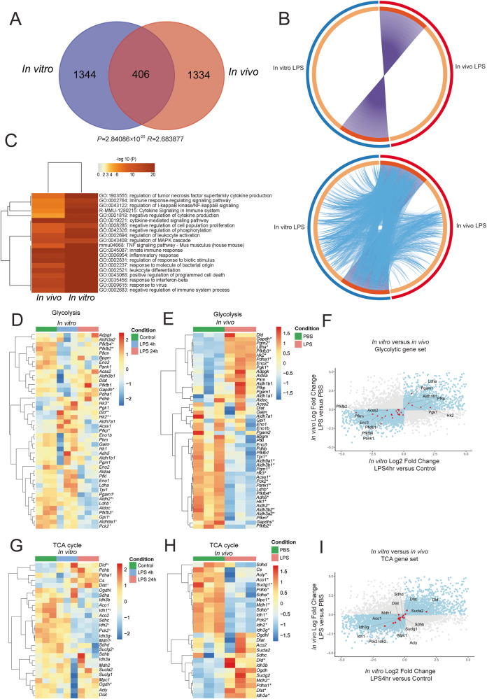
Fig. 2. Transcriptomic changes in LPS-treated primary mouse microglia and in vivo LPS-treated microglia.
A Overlap of DEGs in vitro primary neonatal microglia at 4 h after LPS stimulation and in vivo treated adult microglia 3 h after intraperitoneal LPS injection. The transcriptome analysis of the TCA/glycolytic genes of in vivo microglia was performed using recently published data21. Hypergeometric p-value and enrichment level are for such overlap are depicted. B Circos plots depicting the overlap in the lists of DEGs. On the outside, each arc represents the identity of each gene list, using the following color code: Blue, In vitro primary microglia; red, in vivo-treated microglia. On the inside, each arc represents a gene list, where each gene member of that list is assigned a spot on the arc. Dark orange color represents the genes that are shared by multiple lists and light orange color represents genes that are unique to that gene list. Purple lines link the same gene that are shared by multiple gene lists. For the plot in the bottom, blue lines link the genes that, although different, fall under the same ontology term. Blue lines indicate the amount of functional overlap among the input gene lists. C Heatmap depicting the top 20 statistically enriched terms (GO/KEGG, canonical pathways, etc.) hierarchically clustered into a tree based on Kappa-statistical similarities among their gene memberships. The term with the best p-value within each cluster is shown as its representative term in the dendrogram. Heatmap cells are colored by their p-values. Hierarchically clustered heatmaps depicting gene expression changes in glycolytic pathways in vitro primary microglia (D) and in in vivo-treated microglia (E). Color key corresponds to row Z-score. F Scatterplot that graphically represents the fold changes of genes following LPS stimulation in vitro versus in vivo. Dots in blue depict genes that are increased or decreased in both models (in vitro and in vivo). Dots in red represent glycolytic genes. G, H Hierarchically clustered heatmaps depicting gene expression changes of TCA in vitro and in vivo-treated microglia. Color key corresponds to row Z-score. For the heatmaps, * denotes padj < 0.05 LPS 4 h versus Control, $ denotes padj < 0.05 LPS 24 h versus Control. These padj values can be found in Supplementary Datasets. I Scatterplot that graphically represents the fold changes of LPS stimulation in vitro versus in vivo. Dots in blue depict genes that are increased or decreased in both models. Dots in red represent TCA genes. N = 3 different animals per condition.

