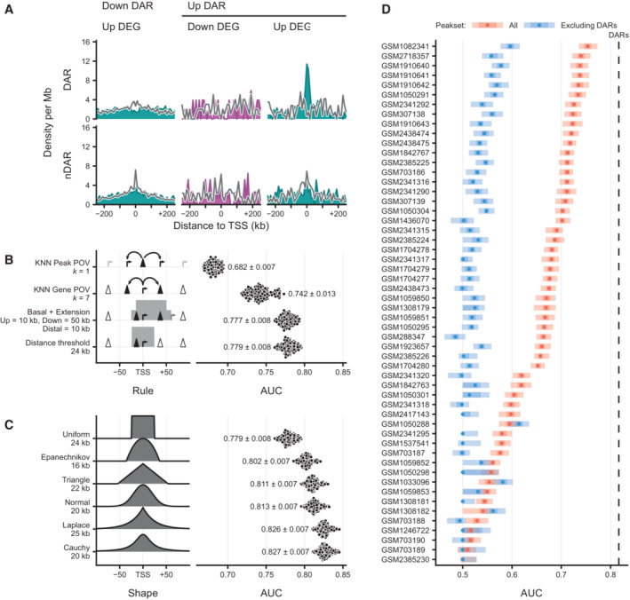
Figure EV4. Characterization of different association rules and chromatin features for the prediction of transcriptional changes.

- Density of peaks in 10 kb bins nearby transcription start sites (TSS) of upregulated (light blue) and downregulated (purple) differentially expressed genes (DEGs) and their expression‐matched stable control (gray) non‐DEGs (nDEGs). Panels indicate the set of peaks that were aligned to the TSS: down differentially accessible regions (DARs) and up DARs. Bottom row shows these densities for an equal number of stable non‐DARs (nDAR) at the same gene sets.
- Predictive performance comparison of different association rules to discriminate downregulated DEGs upon SOX2 depletion at 2 h from matched nDEGs, with counts of associated (n)DAR peaks as predictors. X‐axis metric notes the area under the receiver operator characteristic curve (AUC). Dots represent 100 re‐samplings of the matched nDEGs. Numbers represent mean ± standard deviation. Optimal parameters for every rule indicated at the Y‐axis labels, such as distance = 25 kb and k = 6, were chosen by performing a parameter sweep and choosing the parameter that minimized cross‐validation error. Left part visually indicates association rule.
- Like (B), but for various kernel‐based weighting functions instead of association rules, and weighted sums of peaks instead of counts as predictors. Left part gives visual indication of kernel shape. Numbers represent mean ± standard deviation.
- Predictive power on expression changes based on the many publicly available ChIPseq data, with or excluding peaks overlapping with DARs, for SOX2 in mESC‐like cells (via Cistrome). The dotted line indicate the average predictive power of DARs for context. Y‐axis gives Gene Expression Omnibus accession numbers for the datasets. X‐axis metric notes the area under the receiver operator characteristic curve (AUC). Intervals and medians were calculated for 100 re‐samplings of the matched nDEGs. The light shade gives the 95% inter‐percentile range (IPR), the darker shade gives the inter‐quartile range and the dots give the medians.
Source data are available online for this figure.
