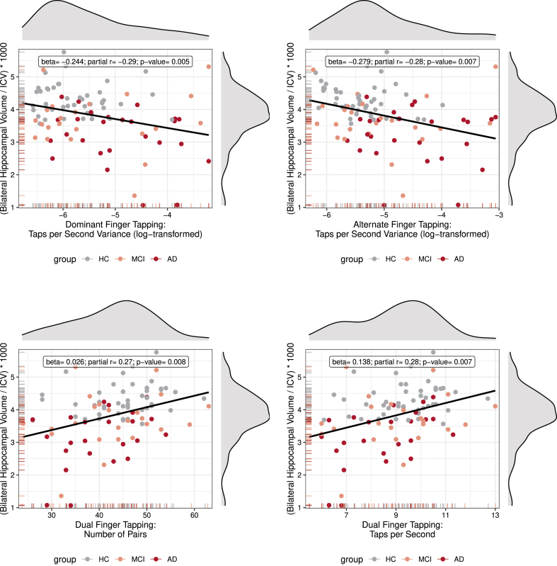
Fig. 4.
Correlations between Hippocampal Volume and Tapping Performance. Scatter plots with density curves (on top and on the right side of each graph) and carpet plots (on the left and bottom side of axis) for both variables. Each graph shows the individual observations color coded for group, and a regression line. Inside the graph is a text box with summary statistics of the partial correlation (adjusted for age and sex) and regression, as well as the p-value for the analysis. Note that, even though individual values are color coded for group, the statistics were calculated for the entire collapsed sample.

