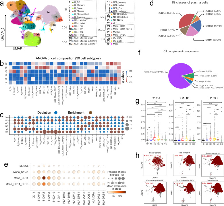
Fig. 2.
Associations between COVID-19 disease severity and PBMC cellular composition. a UMAP projection showing the 30 cellular subtypes identified from 22 samples. Each dot depicts a single cell while color represents the cell subtype. b Heatmap showing the p-values from ANOVA analysis of differences in cell subtype composition between disease types. Disease severity: HD, MI, SE, AE, NE and CO. c Dot plot depicting the 30 cell subtype disease preference as calculated using RO/E. d Classes of heavy chains for plasma cells from AE. e Dot plot showing the expression of selected monocyte marker genes in monocyte subtypes. f Pie chart depicting the relative contribution of each cell subtype to the C1 complement components. g Box plots showing C1QA, C1QB, and C1QC expression in Mono_ C1QA cells between different groups. Significant differences were determined with a two-sided Student’s T-test with Bonferroni correction. Standard Error (SE) and median are shown. h UMAP projection density plots of Mono_CD14 cells from different groups

