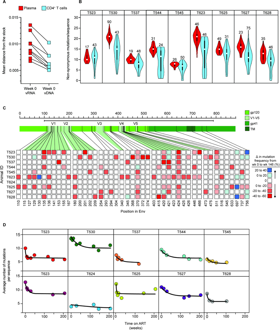
Figure 7. Differences in mutation frequency between time 0 plasma virus and cellular sequences at time 0 and week 146.
(A) Comparison of average pairwise distance from the stock57 between sequences collected from plasma (red) or peripheral blood CD4+ T cell DNA (blue) at the time of ART initiation (t=0). The number of sequences analyzed and standard deviations are given in Table S7. (B) Violin plots comparing the number of non-synonymous amino acid mutations per env sequence in plasma (red) vs. CD4+ T cell DNA (blue) at the time of ART initiation. Numbers above the violin plots indicate the number of sequences included in the analysis. (C) Heat map depicting changes in mutation frequency at different positions in env between sequences collected from week 0 and week 146 for each animal. Week 146 was chosen as a late time point because slight increases in mutational frequency were observed between week 146 and 208, reflecting distortions introduced by the proliferation of particular infected cell clones. Red or blue squares indicate increases or decreases, respectively, in the frequency of sequences with a mutation at the indicate position. Analysis covers sequenced positions where there were mutations away from the stock consensus in at least 20% of sequences at that time point. (D) Decay of non-synonymous mutations in env sequences during ART. Data were fitted to a biphasic model (black line) as described in the Methods section. The number of sequences included in this analysis, mean APD, and standard deviation for each animal at the indicated timepoints are included in Table S7.

