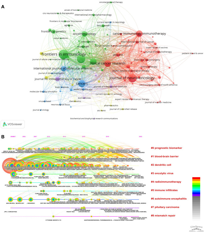
Figure 5.
Analysis of journals. (A) Network visualization map, generated by VOSviewer, depicts journal co-occurrence analysis. Each node symbolizes a journal, with its size proportional to the number of publications within that journal. Each node’s color corresponds to a cluster, with different hues representing distinct clusters. The density of links between two nodes indicates the co-authorship relationship among journals. (B) The timeline view for co-cited journals related to immunotherapy for glioma by Citespace. The size of each node corresponds to the number of co-citations for the respective journals, while the connecting curves between nodes signify co-citation relationships. The color on the right, red, is closer to the present, and purple is older.

