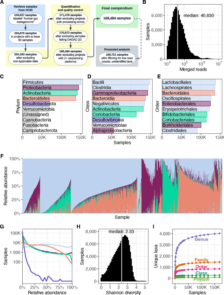
Figure 1. Overview of the Human Microbiome Compendium.
(A) A list of the general steps in the data pipeline and how many samples completed each step. See Methods for more details about each process. (B) A histogram illustrating the distribution of reads that were classified in each sample. The x-axis indicates the number of reads in a given sample, and the y-axis indicates the number of samples with that number of reads. (C–E) The most prevalent taxa observed in the compendium. The reads in each sample are assigned the most specific taxonomic name possible, down to the genus level. Each panel illustrates results when these assignments are consolidated at the three highest taxonomic levels; in each, the y-axis lists the 10 most prevalent taxa at that level, and the x-axis indicates the number of samples in which that taxon was observed at any level. Panel C indicates the most prevalent phyla, and the top five are each assigned a color. These colors are used in the remaining two panels to indicate the phylum of each taxon. Panel D indicates the most prevalent classes of bacteria observed in the dataset, and Panel E indicates the most prevalent orders. Lower taxonomic orders are illustrated in Supplementary Figure 1. (F) A stacked bar plot illustrating the relative abundance of 5000 randomly selected samples from the compendium. Each vertical bar represents a single sample, and the colored sections each represent the relative abundance of a single phylum in that sample. These bars use the same colors as panel C. The samples are sorted first by the most abundant phylum’s identity, followed by the second-most abundant phylum’s identity, followed by the combined relative abundance of these two taxa. For example, the first group on the left is made up of samples in which Firmicutes was the most abundant phylum and Proteobacteria was the second-most abundant. Next is samples in which Firmicutes was most abundant and Actinobacteria was second-most prevalent, and so on. Another version of this figure, sorted by Firmicutes relative abundance, is available as Supplementary Figure 2. (G) A density plot illustrating the relative abundance of phyla across the compendium. Each line represents one of the five most prevalent phyla in the dataset, using the same colors as panel B. The gray line indicates all other phyla. The x-axis indicates the relative abundance of a given phylum in a single sample, and the y-axis indicates how many samples were observed to have that abundance of the given taxon. A version of this figure using a linear y-axis is available as Supplementary Figure 3. (H) A histogram illustrating the distribution of Shannon diversity observed in the compendium. The x-axis indicates a given sample’s alpha diversity, as measured by Shannon Diversity Index. The y-axis indicates the number of samples that were observed to have that score. (I) The results of a rarefaction analysis in which a simulated compendium of various sizes was generated repeatedly and evaluated for taxonomic richness. The x-axis indicates the number of microbiome samples in the simulated compendium, and the y-axis indicates the number of unique taxa were observed in that simulation. Each line indicates the number of observed taxa at successively specific taxonomic levels.

