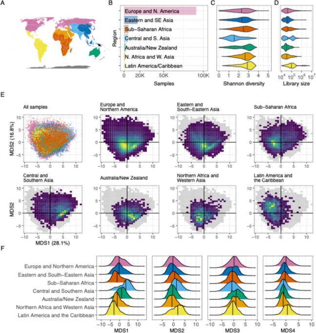
Figure 2. Regional structure.
(A) A map illustrating which areas were categorized into world regions. The colors here match those labeled in panel B. Oceania is represented here in orange, though this region was excluded from these analyses because only four Oceanis samples remained in the filtered dataset used here. (B) A bar plot illustrating the number of samples from each world region analyzed here. The x-axis illustrates total samples, and the y-axis lists all regions evaluated. The colors used here are the same as those used in panel A. (C) A violin plot illustrating the distribution of observed Shannon index values assigned to samples from each world region. The x-axis indicates the Shannon index value, as calculated using all unique taxonomic identifications in samples from each world region. Colors indicate the region (same as in A), and the y-axis for each violin indicates the relative frequency with which diversity of a given magnitude was observed. The vertical lines in each violin indicate the median value. The black points within each violin indicate the mean Shannon diversity as determined by rarefaction analysis (see Methods). (D) A violin plot organized in the same manner as panel C, but the x-axis indicates reads per sample. “Reads” in this case refers to merged reads that were included in the filtered taxonomic table. (E) A series of plots illustrating the results of a principal coordinates analysis of samples from all world regions. The top-left plot is a scatter plot in which each point is a single sample; the color indicates the sample’s region, using the scheme described in panel A. The x-axis is the first PCoA axis, which explains the most variation across the dataset; the y-axis is the PCoA axis explaining the second-most variation. The seven other plots use the same axes, but each includes only samples from a single world region. These plots use a heatmap design rather than a scatter plot, to help evaluate areas with many overlapping points—yellow areas indicate portions of the space with a higher concentration of samples, and dark blue areas indicate portions in which few (but not zero) samples are found. The gray shadow indicates the area occupied by all points from all world regions. (F) A series of density plots illustrating the distributions of the first four axes of variation determined by the ordination analysis displayed in panel E. Each panel illustrates a single factor; the x-axis indicates the value of that factor, and the y-axis indicates the relative frequency of the value in the given world region.

