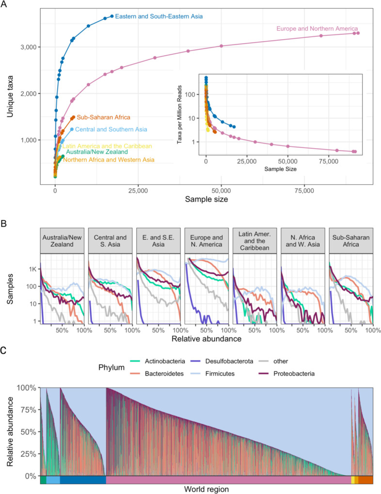
Figure 3. Geographic regions vary in microbiome composition.
(A) The number of unique taxa discovered in subsamples of varying size from each world region. Each point represents the average number of unique taxa identified in a subsample from a given region over 1,000 repetitions. The x-axis indicates the number of microbiome samples selected, the y-axis the number of unique taxa identified in those samples, and the color indicates the world region being sampled. The inset uses the same x-axis and color scheme but displays the average number of taxa discovered per million reads on the y-axis. (B) Histograms illustrating the distribution of the relative abundance of the most prevalent phyla in the compendium. Each panel visualizes all samples from a single world region. The x-axis indicates the relative abundance of the taxon, and the y-axis indicates the number of samples (on a log scale) with the indicated relative abundance. Each line illustrates the results for a single phylum, indicated by line color. (C) As in Figure 1F, this stacked bar chart shows the relative abundance of the five most prevalent phyla in the compendium. Each column is a sample, and the colored segments indicate the relative abundance of a given phylum in that sample. Phylum color follows the same color scheme as Figure 3B. Samples are ordered first by world region (indicated by the colored bar below the x-axis), and then by relative abundance of the 5 most prevalent phyla, as in Figure 1F. World region color follows the same color scheme as Figure 3A.

