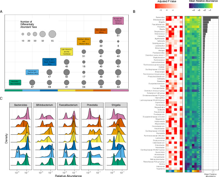
Figure 4. Taxa are differentially abundant between world regions.
(A) 65 taxa were selected to be tested for differential abundance between regions. The x and y axes are each colored by world region; at each intersection, the size of the circle and the number underneath it indicate the number of taxa that were significantly different between the two regions listed. (B) The red-white heat map illustrates adjusted p-values for regional differences when each world region is compared to Europe and Northern America. The y-axis lists all evaluated genera, the x-axis lists each region (using the same color scale as panel A), and each cell represents the strength of the differential abundance result for that taxon. The blue-green heat map illustrates mean relative abundance (log 10) of each taxon in each world region, as indicated by the x-axis. The bar chart illustrates the mean relative abundance of each taxon across all regions. (C) Each panel illustrates the relative abundance (log 10) of one of the 5 most abundant taxa. Each colored area indicates the distribution from a single world region, using the same colors as panel A. The x-axis indicates (log 10) relative abundance of the specified genus, and the y-axis indicates the relative frequency with which that abundance is observed in the specified region. Black vertical lines indicate the median.

