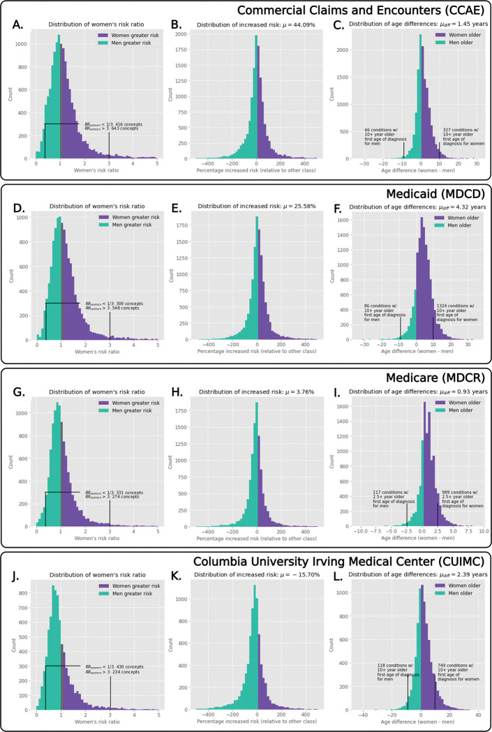
Fig. 2. Population-level distributions showing women’s risk ratios, increased risk, and age of onset differences.
We visualize the women’s risk ratio distributions for the various datasets (left-most column), where we see that, in the largest two databases, women are more likely to be more at risk (as shown in the differences in counts). Considering the increased risk (middle column) for all datasets except CUIMC, women were at increased risk for all conditions. When we examine age of onset distributions (right-most column), women are consistently older when first diagnosed for all conditions across all datasets.

