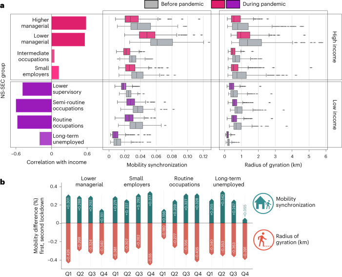
Fig. 4. Relation between the NS-SEC classification, income and their impact on the spatio-temporal mobility patterns before and during the pandemic.
The ‘Before pandemic’ label corresponds to the period from April 2019 to February 2020, while the ‘During pandemic’ corresponds to the period between April 2020 and February 2021. a, The correlation between the NS-SEC classes and the population income (N = 316 English local authorities). The classes coloured in pink and purple have positive and negative correlations with the population income. The box plot consists of boxes that span from the 25th percentile (Q1) to the 75th percentile (Q3), with median values (50th percentile) represented by a central line. The minimum and maximum values are determined by subtracting 1.5 times the interquartile range (IQR) from Q1 and adding 1.5 times the IQR to Q3, respectively. Also shown is the radius of gyration/mobility synchronization of each NS-SEC class before and during the pandemic. b, The differences between the first and second lockdowns in the spatio-temporal metrics.

