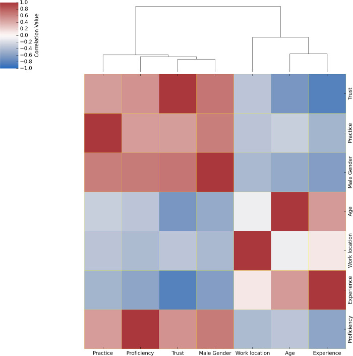
Fig 1. Correlation heatmap of continuous variables for the entire participants of this study.
The continuous variables were imputed, normalised and Pearson’s correlation was calculated. The resulting correlation matrix is plotted for all the participants of this study (n = 106). The colour scheme key ranging from 1 to -1 denotes red colour to be positively correlated, blue to be negatively correlated and white to have no correlation among the variables. Correlation clustering dendrogram depicts the relative associations among variables.

