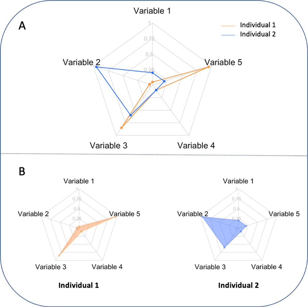
Fig. 1.
Sample radar chart. Panel A: two individuals are displayed in one radar plot with two different colours. Panel B: two individuals are plotted side by side with shaded connected regions. (For interpretation of the references to color in this figure legend, the reader is referred to the Web version of this article.)

