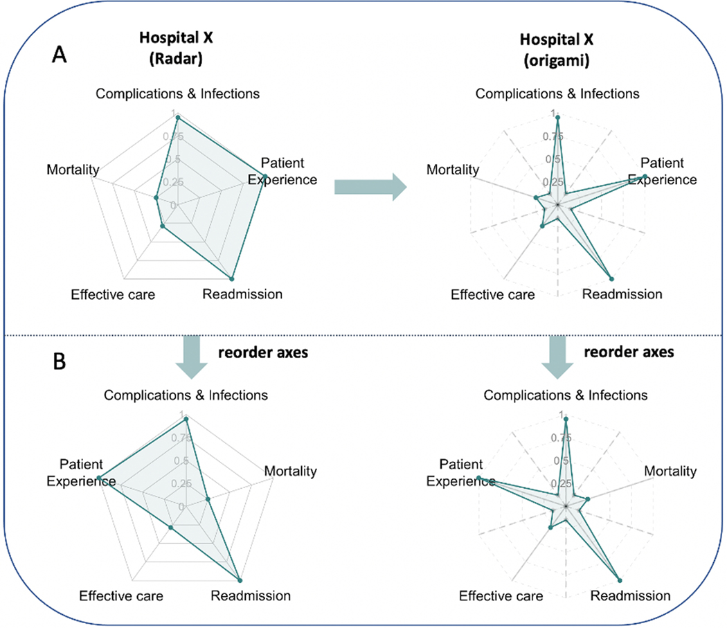
Fig. 3.
Panel A illustrates a sample radar chart and origami plot using the same dataset from hospital X. For the origami plot, five auxiliary axes (dashed lines) are added in addition to the original five main axes (solid lines) in the radar chart. Each dashed line is placed equidistant between two axes. Points on the main axes are the same in both plots. In the origami plot, an additional five points are added to each auxiliary axis with the same distance to the origin. All points are connected in order. Panel B illustrates that after a change in the order of the axes, the size of the shaded area in the radar chart changes, while the size of the shaded area in the origami plot remains unchanged (a proof is provided in the supplement).

