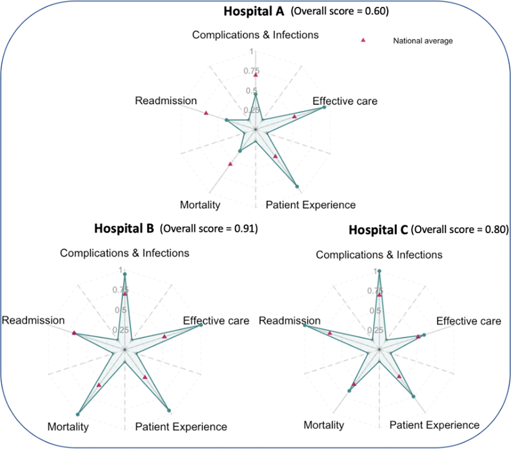
Fig. 4.
Performance of three different hospitals presented using origami plots. Hospitals are compared based on scores evaluating mortality, complications and infections, timely and effective care, readmission, and patient experience. All scores are on a scale from 0 to 1 as percentiles among all the hospitals, with larger values indicating better performance. An overall score is calculated as the average score across five metrics, and it is proportional to the area of the shaded star. Pink triangles on the main axes indicate the average performance across all hospitals in the Centers for Medicare & Medicaid Services hospital compare database. (For interpretation of the references to color in this figure legend, the reader is referred to the Web version of this article.)

