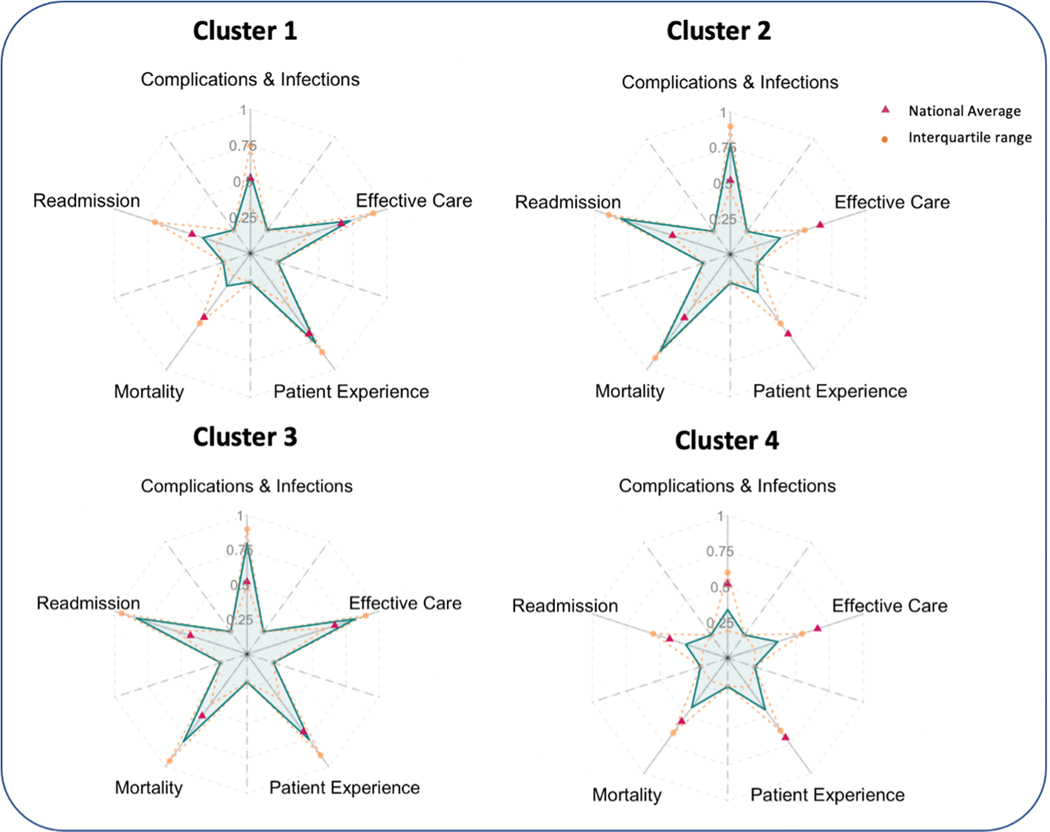
Fig. 5.
Performance of four clusters of hospitals using origami plots. Clusters identified by K-means cluster analysis of 4,671 hospitals. Each axis plots the average percentile of the hospitals in the cluster for a particular attribute. Pink triangles on the main axes indicate the average performance across all hospitals in the Centers for Medicare & Medicaid Services hospital compare database. The orange-dashed lines indicate the interquartile range of each cluster. (For interpretation of the references to color in this figure legend, the reader is referred to the Web version of this article.)

