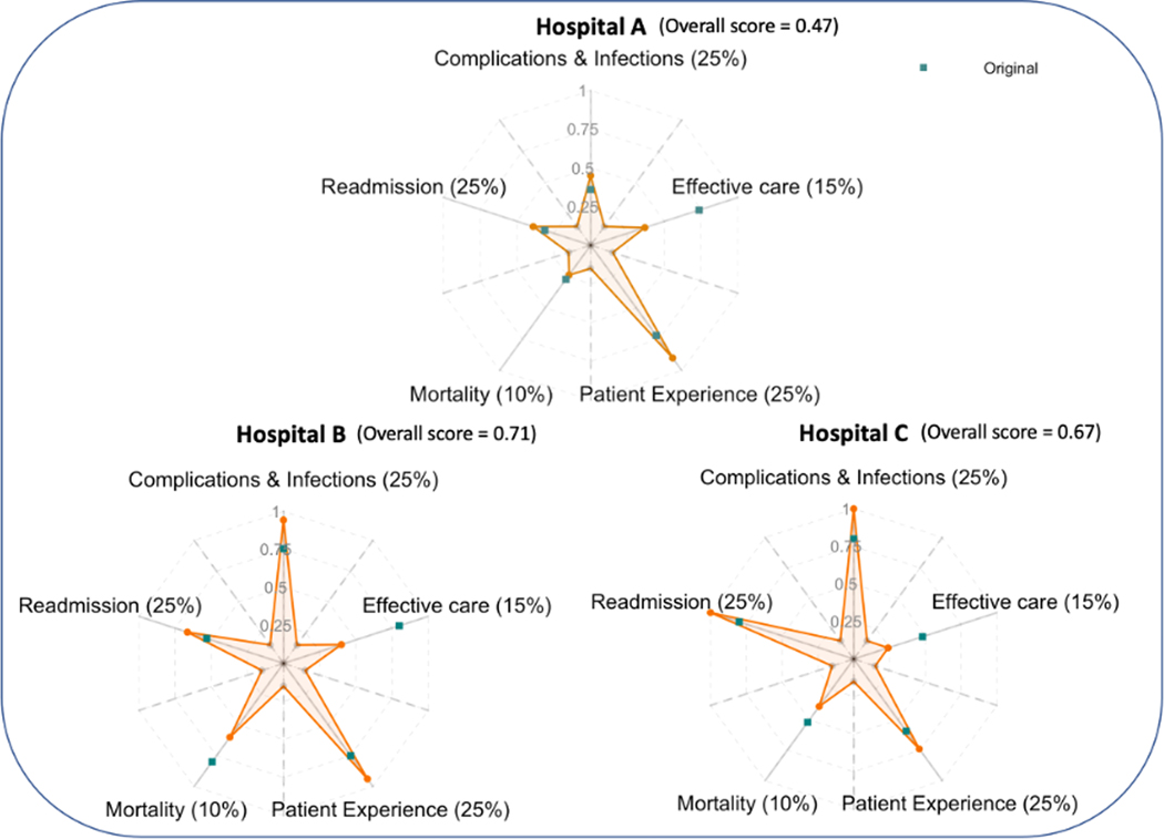
Fig. 6.
Performance of three hospitals presented as a weighted origami plot. Metrics including mortality, timely and effective care, readmission, patient experience, and complication & infections are assigned weights 10%, 15%, 25%, 25%, and 25% (summing up to 100%), respectively. An overall score calculated as the weighted average score across five metrics is proportional to the area of the connected regions. The green squares show the original attribute scores. The vertices of the weighted star are the weighted scores. (For interpretation of the references to color in this figure legend, the reader is referred to the Web version of this article.)

