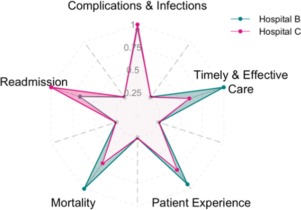
Fig. 7.
Equally weighted pairwise origami plot. Comparison between hospitals B and C are represented in two distinct colors (green and pink). The shaded regions in green indicate metrics in which hospital B performs better than hospital C, and shaded regions in pink show metrics in which hospital C performs better than hospital B. (For interpretation of the references to color in this figure legend, the reader is referred to the Web version of this article.)

