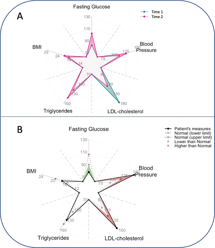
Fig. 8.
Two potential use cases of the pairwise origami plot for monitoring clinically relevant health measures (fasting glucose level, BMI, blood pressure, LDL-cholesterol and triglycerides) in a single patient. Panel A: Comparison between two times. From time 1 to time 2, fasting glucose level, blood pressure, and triglycerides increase, while LDL decrease. Panel B: Comparison to normal limits. For each attribute, normal ranges of individual variables are indicated by the dashed lines (green: lower limit; red: upper limit) (black solid line). If one value is higher than its upper limit, the region between the upper limit and the value is shaded in red; if it is lower than its lower limit, the region between the upper limit and the value is shaded in green. (For interpretation of the references to color in this figure legend, the reader is referred to the Web version of this article.)

