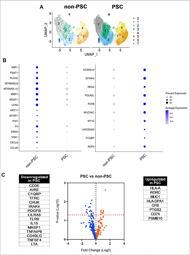
Figure 3. Transcriptomic profiling of PSC and non-PSC ECO.
A) UMAP plots comparing clusters from PSC (n=4) and non-PSC (n=4) ECO. B) Dot plots visualizing DEG between PSC and non-PSC ECO. Color indicates average expression; size of the circle indicates percentage of cells expressing each gene. DEG were determined by a p-value <0.05, Log2Fold change >0.2, and their presence in at least four clusters. C) Volcano plot comparing PSC (n=6) and non-PSC (n=5) ECO by NanoString analysis. Dots represent a downregulated (blue) or upregulated (orange) gene. Line (red) indicates p = 0.05. Statistically significant genes are listed next to volcano plot.

