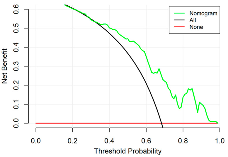
Figure 5.
Decision curve analysis for the nomogram. The y-axis measures the net benefit. The green line represents the nomogram. The green line represents the nomogram. The red line represents the assumption that no patients have a risk for neonatal intracranial hypertension (NICH) and the black line represents all patients who will develop NICH.

