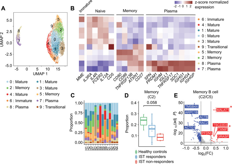
Figure 6.
B cell subclusters. (A) UMAP plot of B cells. (B) Heatmap of the expression of marker genes used to identify the cell type of each subcluster. Red and blue colors denote upregulated and downregulated genes, respectively. (C) Proportion of B cell subclusters in each sample. (D) Box-and-whisker plot comparing the proportion of B cell subcluster 0 among healthy controls, IST responders, and IST non-responders. The solid horizontal line represents the median, the lower boundary represents the lower quartile, the upper border represents the upper quartile, and the whiskers represent outliers (t-test, *P < 0.05). (E) Volcano plot for DEGs between B cell subclusters 2 and 5. Red and blue dots denote upregulated and downregulated DEGs, respectively, with an adjusted P value <0.05 and a |log2(FC: fold change)| >0.25. DEG = differentially expressed genes; IST = immunosuppressive therapy; UMAP = uniform manifold approximation and projection.

