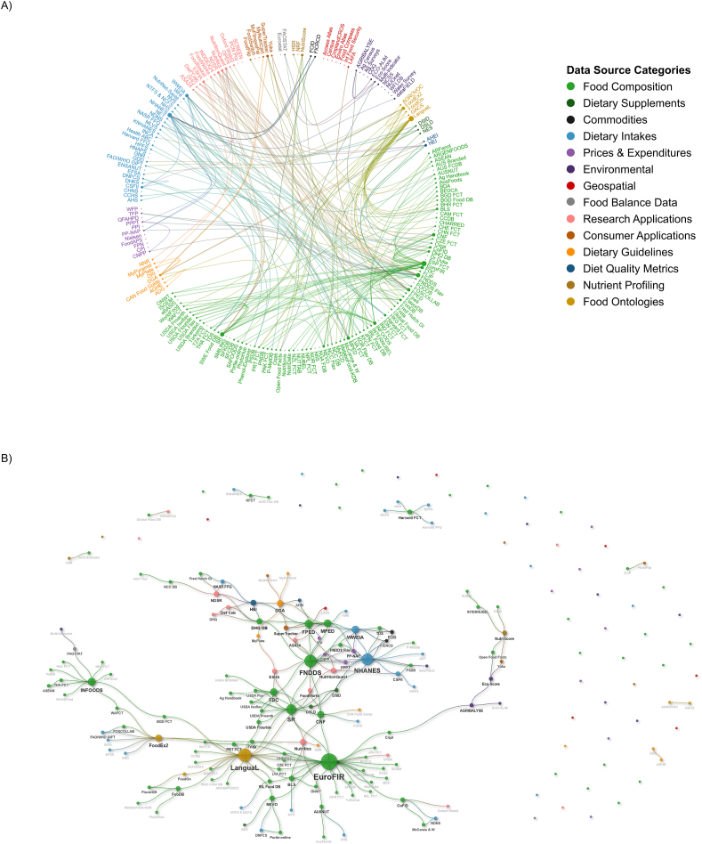
FIGURE 2.
Food systems connectedness. Connections between food systems data are illustrated as (A) a chord diagram and (B) a neural network–type visualization. Each small circle represents one data source and lines connecting data sources represent crosswalks. The size of each data source circle reflects the number of crosswalks to the data source, and color indicates the data source category. A full index of databases including abbreviations and citations can be found in Supplemental Table 1.

