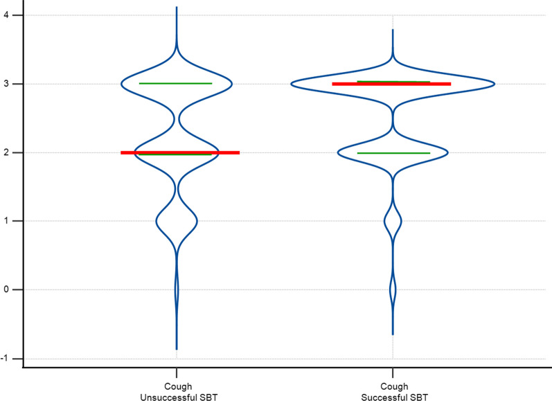
Fig. 2.
Violin plot of the objective cough measurement by spontaneous breathing test (SBT) success. Violin plot illustrating objective cough measurement data distribution within successful and unsuccessful Spontaneous Breathing Test (SBT) groups. The density curves visually represent data point frequency across the distribution range. In this figure, the width of each curve is proportionate to the approximate frequency of data points within the corresponding region. Red lines represent median values for each group, while green lines denote the 25th and 75th percentiles

