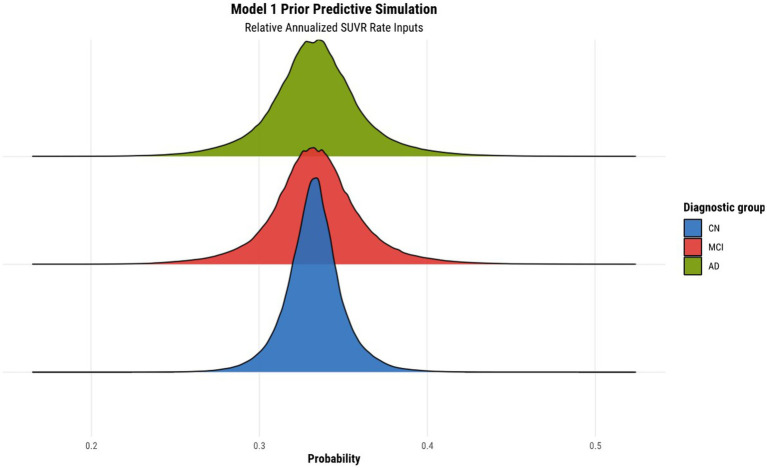
Figure 1.
Prior predictive simulation for model 1 using relative annualized SUVR as input. The x-axis of the plot indicates the probability of being classified in a particular diagnostic group. The distributions are color coded according to the corresponding diagnostic group, where the green, red, and blue colors represent the AD, MCI, and CN diagnostic groups, respectively.

