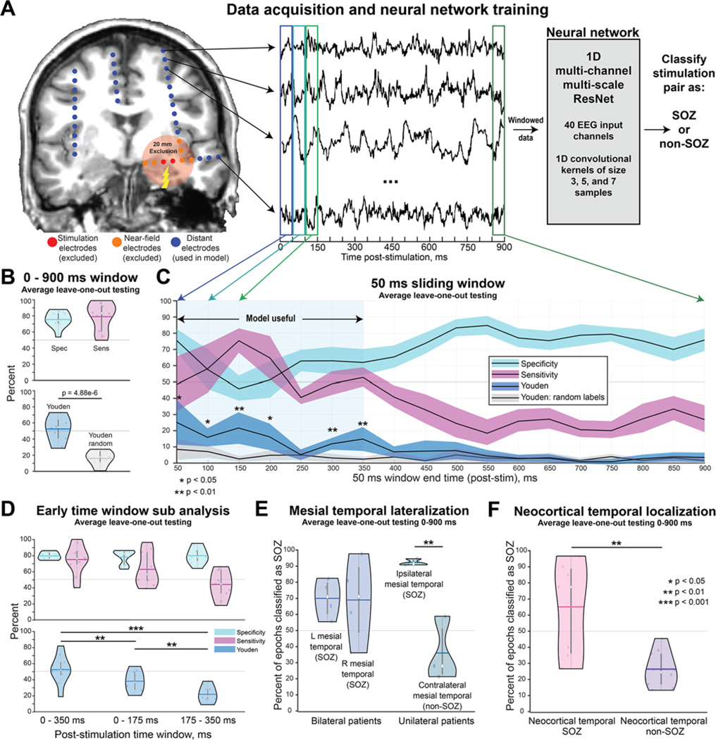
FIG. 1.
Deep learning on distant SEEG evoked responses can accurately classify SOZs. A: We conducted SPES on all gray matter bipolar pairs of contacts in 10 patients who underwent SEEG. This resulted in over 500,000 poststimulation epochs from the recording channels. To avoid stimulation artifacts and biases related to contact implantation density due to the clinical hypotheses, we excluded recordings from contacts within 20 mm of the stimulation site. We then trained a CNN to classify whether a clinically defined SOZ or non-SOZ had been stimulated. B: We first trained the model using the entire 0- to 900-msec poststimulation window. This resulted in a sensitivity of 78.1% and specificity of 74.6%, with a significantly improved Youden index compared with the model trained with random labels. C: For the 50-msec sliding windows, the model performed better than with random labels for the 0- to 350-msec poststimulation period with 50-msec intervals. Paired t-tests with Bonferroni-Holm multiple comparison correction were conducted between the Youden index (blue) and the random-label Youden index (gray). Note that the values on the x-axis represent the ending time of the 50-msec window. D: Use of only the 0- to 350-msec window resulted in model accuracy comparable to that obtained with the 0- to 900-msec window. However, dividing this window into 0- to 175-msec or 175- to 350-msec periods resulted in a significant reduction in the Youden index. E: The model did not simply classify all mesial temporal structures as SOZs. For bilateral patients, the model classified left and right mesial temporal structures as SOZs with comparable confidence around 70%. For unilateral patients, the model correctly classified ipsilateral mesial temporal structures as SOZs at a rate of 91.5% and contralateral (i.e., non-SOZs) at a low rate of 35.1%. This suggests that the model can accurately classify unilateral versus bilateral seizure onset. F: The model correctly classified neocortical temporal SOZs 64.4% of the time, with a low false-positive rate of 26.0%. The white dots in the violin plots represent median values, the horizontal bars represent mean, and the vertical bars represent interquartile range. Figure is available in color online only.

